Himedi
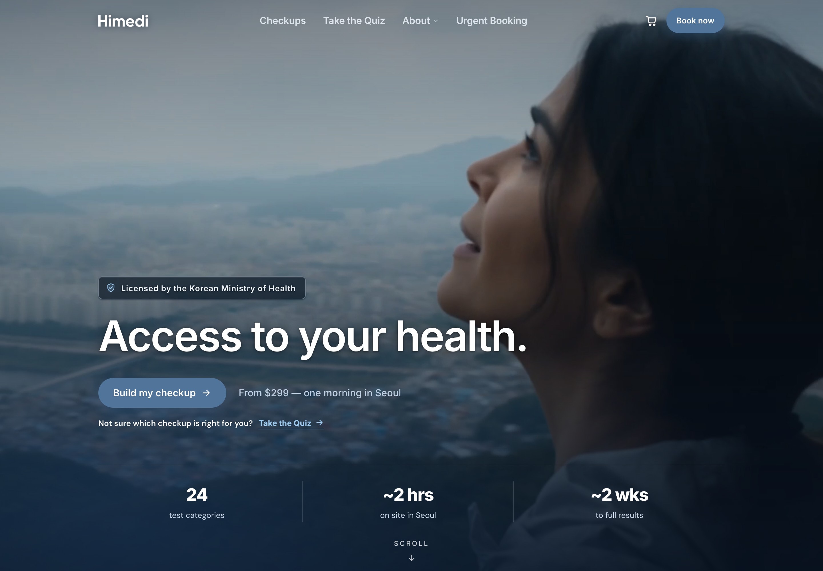
I joined Himedi, a startup that books medical checkups in Korea, in December 2024 and took on design for the U.S. storefront. Most of my time went into two things, the brand and the flow a customer goes through to build and book a checkup.
Product Design · Dec 2024 to present
Every screen on this page came from the live site, so if you want to check my work the whole flow can be found at himedi.com.
What I did
- I led design for the U.S. storefront, from the homepage that makes the case for booking through Himedi to the screens where a customer places an order.
- I built the brand system, from the typefaces and the palette down to the kind of photograph we would use, because nobody at the company had one to hand me.
- I took my designs to production by directing AI coding tools, since there was no front-end engineer on the team, so what a customer saw was what I had designed.
Who it’s for
Himedi began as a concierge service that had to convince Americans a checkup in Korea was worth the trip, so the site asked people to decide whether to travel and what to book in the same visit. We eventually narrowed the audience to people who already had a trip to Korea planned, and for them the only question left was why they should book through us rather than go straight to a clinic.
I approached it by mapping what that person already knew against what they still had to be shown, and that turned the site from a pitch for Korea into a set of answers in the order a visitor would ask for them. The quiz became the door for anyone who arrived without a checkup in mind, so the pages that mattered could stay simple.
The quiz

The homepage
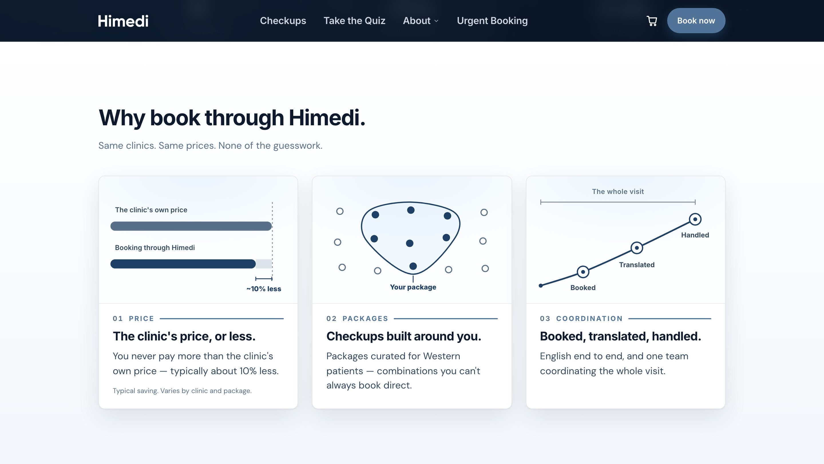
The homepage had one job, which was to convince someone who already had a trip to Korea planned that booking through us was the better way to get a checkup there. So I decided it would make that one argument and moved the quiz and the tier comparison onto separate pages, where a visitor who was ready to choose could take their time.
I wrote the argument down as three plain reasons before I designed anything, and then built the page to carry them. The price would be the clinic’s or less, the package would be built around them, and the appointment would be booked, translated and handled for them.
The booking flow
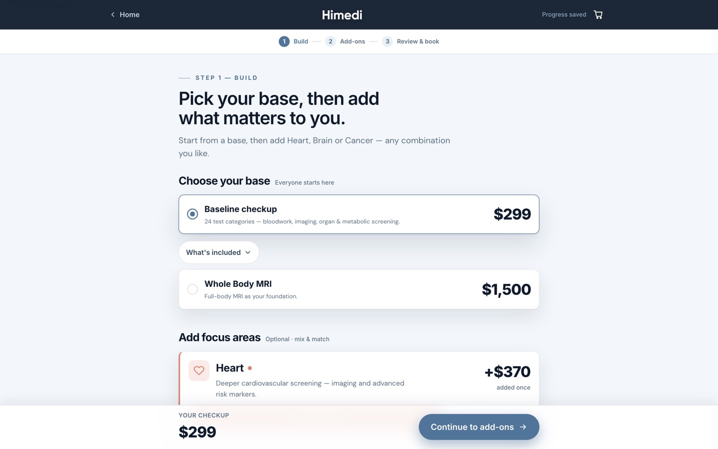
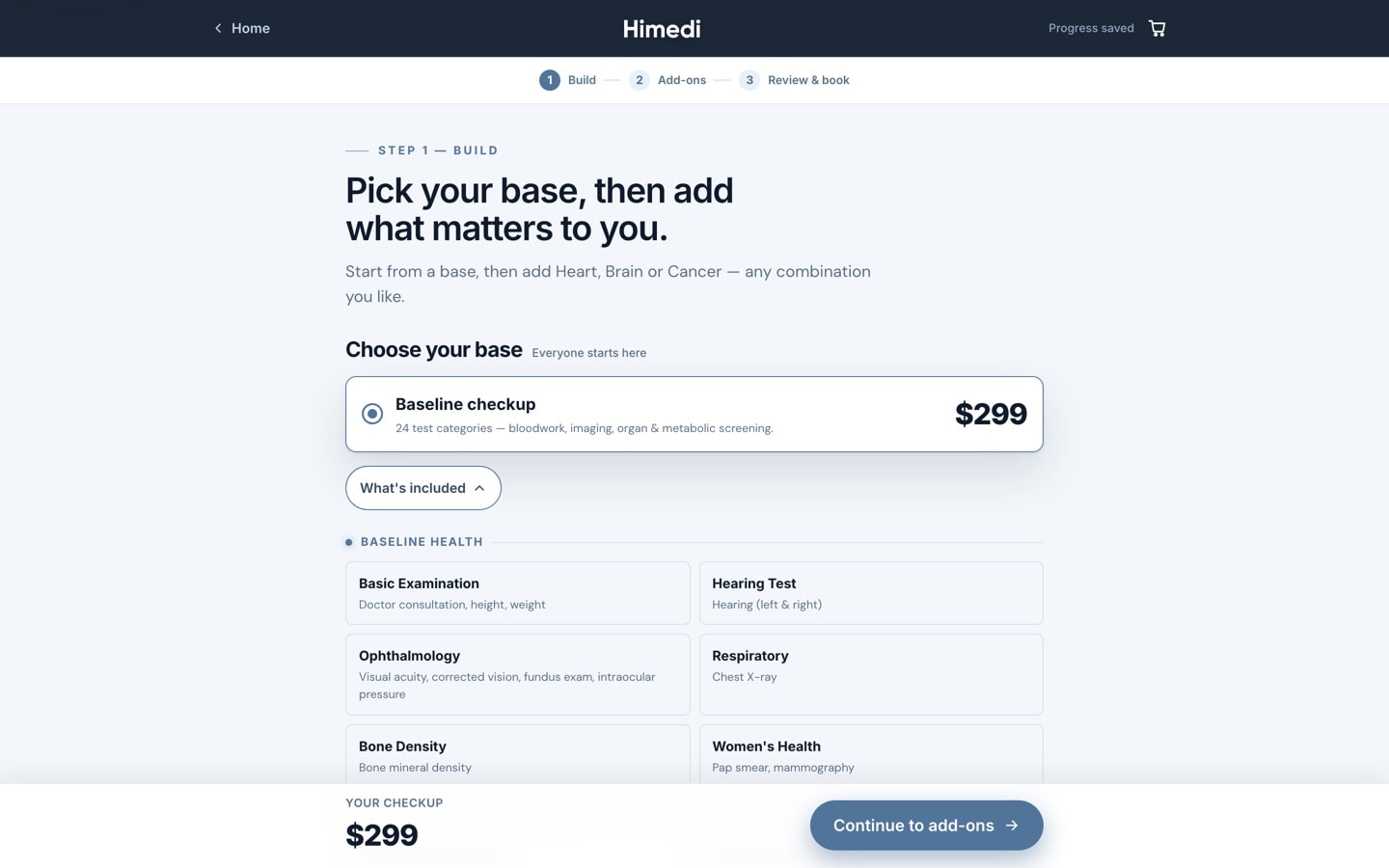
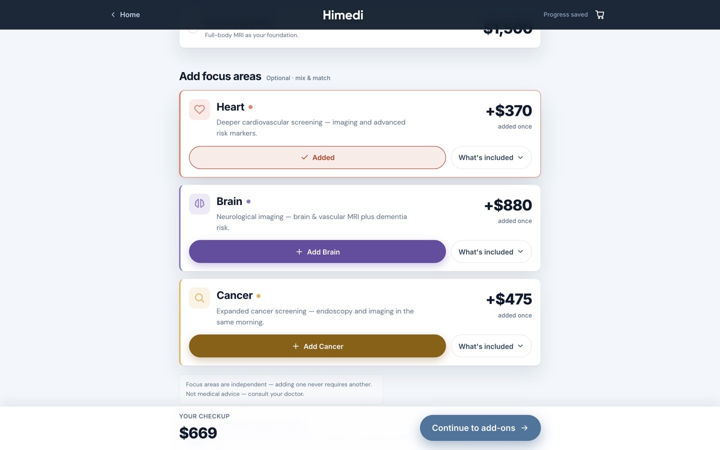
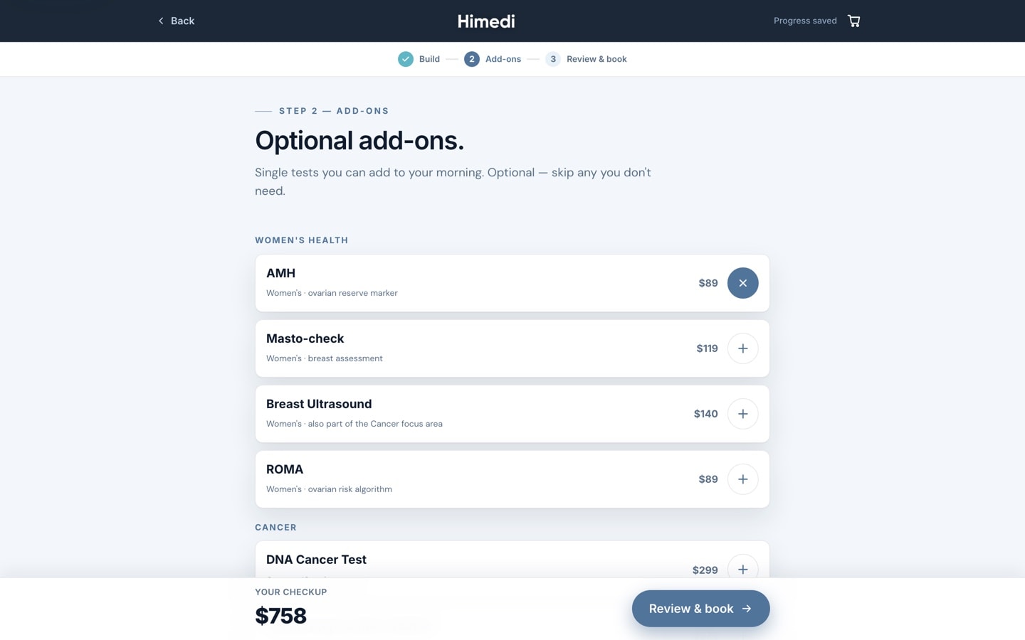
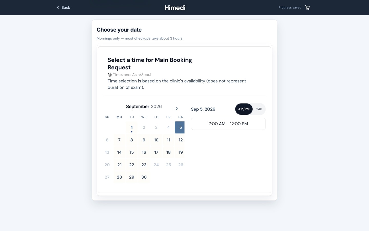
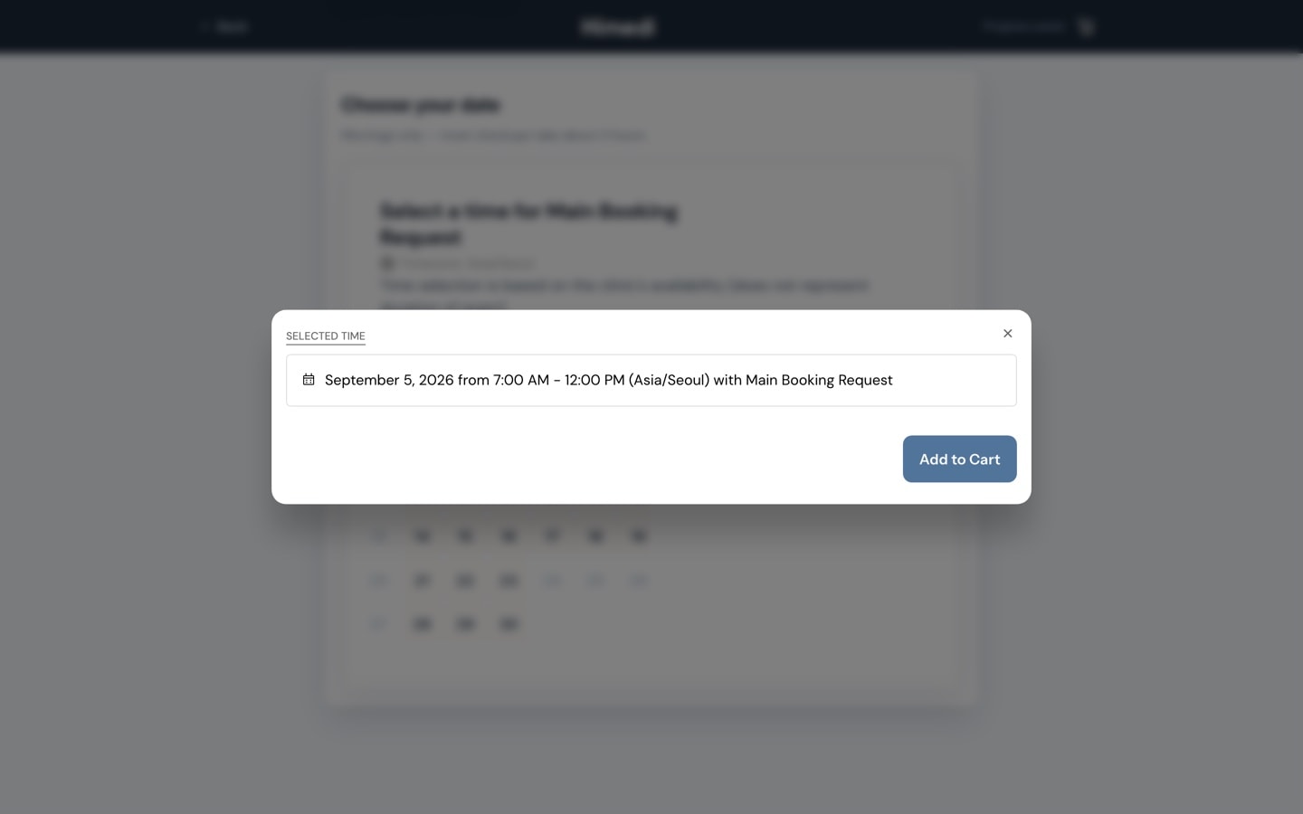
The flow had to keep the promise the homepage made, that the checkup would be built around whoever was booking one. So a customer picked a base checkup, added the areas they wanted covered, then reviewed and booked, and what they ended up with was one they had put together themselves.
The first version sold three tiers of depth, which read like an upsell once I went through it as a customer, so I broke that one choice into two smaller questions. I had the flow work out price and eligibility itself rather than have someone set them by hand on each product, since there were far too many combinations to maintain one at a time.
Step 1 · Choose a base
Step 1 · What’s included
Step 1 · Add focus areas
Step 2 · Add-ons
Step 3 · Select a date
Step 3 · Time selected
Building it
There was no front-end engineer on the team, so the only way my designs reached production was for me to direct AI coding tools to build them. That let me put a layout into the real product in an afternoon and go through it the way a customer would, on a phone, which is where most of Himedi’s visitors arrive. The problems a mockup would never have shown me turned up while there was still time to fix them, and what shipped was the whole path from the homepage’s argument to a booked checkup.
The brand system
The brand was mine to make, because nobody at Himedi handed me a palette or a typeface when I arrived. Every value a visitor saw on the site, down to the colour of a button, was there because I had decided it should be.
I cut the site’s type down to a short scale of sizes and two faces, one for headlines and prices and one for reading. That way anything a customer read, from a hero headline to a price in the cart, was set the same way on every page.
The three focus-area colours were chosen to be light and friendly, which made them fail as button fills once white text sat on them. So I made a deeper version of each one for the buttons and kept the light ones for borders and icons.
Typography
I chose Inter for headings, prices and controls, and DM Sans for the copy a reader settles into. The specimen below was set in the real faces at the sizes the site used, so you can judge the pairing yourself.
Show the type scaleHide the type scale
- Inter
- Headings, prices, buttons and navigation
- DM Sans
- Body copy, and the default on every page I redesigned
A checkup in Seoul, $299
Display · 74px · Hero headlinesA checkup in Seoul, $299
Headline · 44px · Section and page headlinesA checkup in Seoul, $299
Subhead · 30px · Sub-sections, prices and large numbersA checkup in Seoul, $299
Card title · 21px · Card titles, ledes and drawer navigationA checkup in Seoul, $299
Body · 17px · Body copy, buttons and formsA checkup in Seoul, $299
Small · 14px · Captions, hints and small buttonsA checkup in Seoul, $299
Extra small · 12px · Eyebrows, badges and legal
Colour
Blue was already the brand colour and I let it do most of the work, so the rest of the palette was built to sit beside that blue. The navies became the dark surfaces that photography and scan imagery sat on, and I kept the three accents for the focus areas a customer chooses in the checkup builder.
Himedi blue
#51749bBlue deep
#3f5c7cBlue light
#7ea3ccBlue glow
#9ccbf2Teal
#5fb6c4Teal text
#2c7a87Gold
#e3b765Navy 900
#0a1726Navy 850
#0c1d30Navy 800
#102438Navy 700
#16314eNavy 600
#1e4067Light
#f3f7fbLight 2
#e8f0f8Light warm
#f7f9fbCard white
#ffffffText dark
#0f1b2dText soft
#33485fText muted
#5a6f88On dark
#eef4fbOn dark soft
#c2d2e6On dark mute
#90a6c2Heart
#e0846fBrain
#8e7cc3Cancer
#e3b765Heart deep
#b64227Brain deep
#7059b3Cancer deep
#886119
Imagery
I worked with three kinds of image on the site and kept them apart on purpose, because each one had a different job to do for the visitor looking at them.
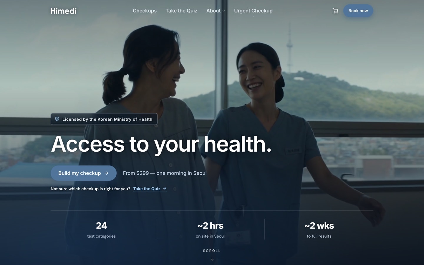
Documentary
I wanted the people on the site to look caught in the middle of a morning rather than posed, a patient in a gown and a nurse in scrubs and nobody facing the camera. The imagery was documentary in style, with a good deal of it enhanced with AI to get that look, and all of it was graded cool and grey-blue. We were selling a morning in a clinic, and a visitor had to be able to picture themselves in one.
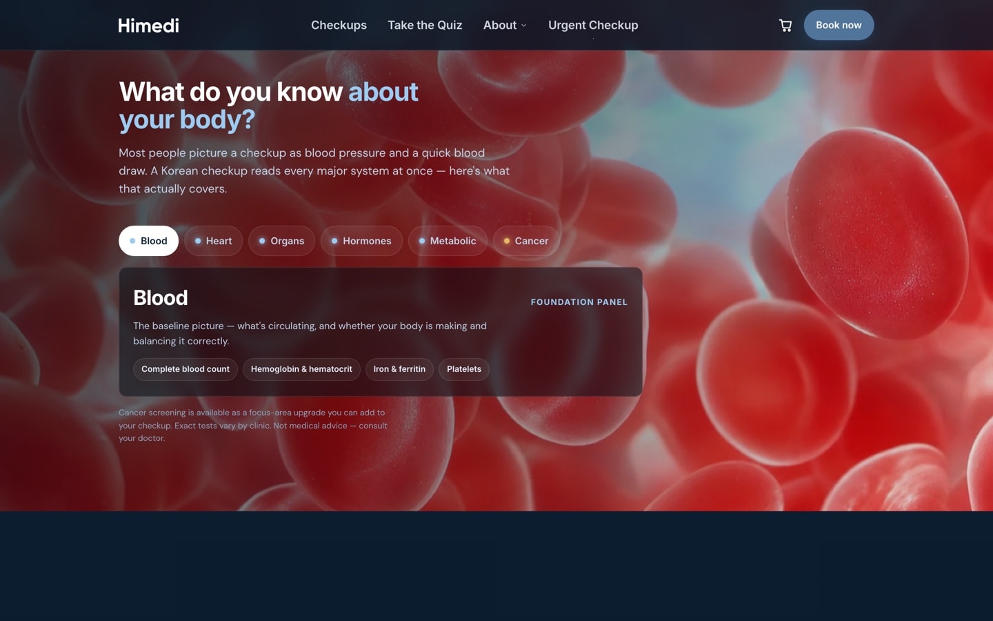
Abstract biology
For the dark section that asks what you know about your body, I kept the macro biology photoreal and let the visitor switch the layer behind it by focus area. The imagery answered whichever tab they had chosen, rather than running on a loop as decoration nobody had asked to see.
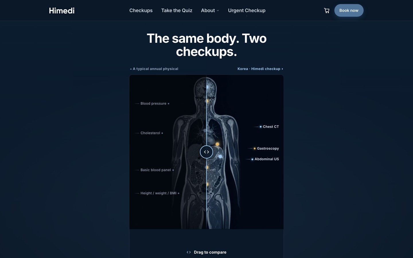
Diagnostic output
Behind the divider a visitor drags to compare an American physical with a Korean checkup, I put a whole-body scan, cold blue-white on near-black. That section was the older argument that Korea was worth the trip, and the scan was the thing it was selling, which happened to sit in the same colour family as the palette.